CSS Grid Navigation Bar
Published: 2020-08-20 | Last Updated: 2022-01-09 | ~8 Minute Read
Finally updating my blog navigation bar
Since the release of Bourne to Blog I have been wanting to add a CSS sample file, however the current navigation bar of the site was not to my entire liking.
So I decided to update it so that way I can include a sample file for Bourne to Blog that contains a fully working CSS Grid core layout for others to modify at their whim.
The Current solution
Currently in the website menu bar I was using floats and it kept coming to mind that there had to be a way to do it with CSS Grid natively.
The current solution is pretty simple and looks like the following:
HTML:
<nav>
<ul>
         <li><a href="/index.html">Home</a></li>
         <li><a href="/blog/blog.html">Blog</a></li>
         <li><a href="/apps/apps.html">Applications</a></li>
         <li><a href="/pages/pages.html">Websites</a></li>
         <li><a href="/games/games.html">Games</a></li>
         <li id="feed"><a href="/feed.xml"><img src="/img/feed.png" alt="RSS Feed"></a></li>
    </ul>
</nav>
So far so good
CSS:
body {
display:        grid;
grid-template-columns:  1fr 50% 1fr;
}

nav {
grid-column:        1 / 4;
grid-row:       1;
}
.
.
.
This is where things get a bit…off in the navbar CSS:
/* Navigation Bar */
nav {
    color:          var(--white-color);
}
#feed {
    float:          right;
}
nav ul {
    list-style-type:    none;
    margin:         0;
    padding-left:       23.7%;
    overflow:       hidden;
    background-color:   var(--menu-bar-color);
}
nav ul li {
    float:          left;
}
nav ul li a {
    display:        block;
    color:          var(--color-white);
    text-align:     center;
    padding:        .7em 1.5em;
    text-decoration:    none;
}
nav ul li a:hover {
    background-color:   var(--dark-color);
    color:          var(--color-white);
}
nav ul li a img {
    padding:        .37em;
}
So we have all sorts of things here, float left and right for the menu items, then 23.7% of padding on the left, then .7em 1.5em padding on the a tags of the lis from the ul tags inside the nav block.
This is what the media queries look like:
/* Tablet Sized Screens */
/* Navigation Bar */
nav ul {
    padding-left:           11%;
}

/* Mobile Sized Screens */
/* Navigation Bar */
nav ul {
    padding-left:           0;
}
nav ul li a {
    padding:            .7em .5em;
}
Again, we have some random numbers there that I’d prefer not to have to ease maintainability.
It has been working fine until now, but I think we can do a little better than that.
CSS Grid Navigation Bar
I looked around but couldn’t find any ready made solutions for this simple problem, possibly because it’s one of those things that “everyone magically knows how to do” or something.
So I started playing around with different approaches to this and it was proving to be harder than it seemed. I kept getting strange behavior while using ul elements within the nav block.
I found the reason for this, I was expecting strange behavior from CSS Grid, it was actually behaving normally. I was grouping the menu elements inside the unordered list, so all elements were staying on one side of the grid that I was defining.
After a while of thinking about this I thought, what actually makes up a menu? We’re usually told that it’s an unordered list with a bunch of list items in it (Or at least I had that impression anyway). However the underlying HTML tags of a navigation bar are links! (Big realization for me, maybe not for others :P )
So I thought, if I used only the a tags for the menu I can manipulate them directly from CSS Grid. This will do away with some HTML and provide a way for the navigation bar to natively be responsive like the rest of the page.
The updated HTML now looks like this:
<nav>
<a id="menu-one" href="index.html">Home</a>
<a href="blog/blog.html">Blog</a>
<a href="apps/apps.html">Applications</a>
<a href="pages/pages.html">Websites</a>
<a href="games/games.html">Games</a>
<a id="feed" href="feed.xml"><img src="img/feed.png" alt="RSS Icon"></a>
</nav>
Now for the new and improved CSS:
nav {
    grid-column:        1 / 4;
    grid-row:       1;
    display:        grid;
    grid-template-columns:  25% repeat(6, 1fr) 25%;
    grid-gap:       1em;
}
This section basically does all the magic, because we combine and overlap two grids on the page in controlled manner. One from the body block which is what defines the entire page look, and a second sub-grid in the nav block that allows us to have control over the individual items in the menu.
In a visual way, the first grid for the entire page looks like this:

The second grid exists within a sub-set of the area of the first, like so:

Both live in harmony but also allow us to have finer control over certain items, in this case the menu a tags, pretty sweet!
In this next section of the CSS we complement the above magical effect of both grid with some default behavior from CSS Grid. Once you define the positioning from one element, the rest of the elements in the block fall in sequence after the first one that was defined unless told otherwise.
Some might argue here, and would possibly be right, that it’s better to define the behavior for each item in a way that allows us to predict the item behavior as much as possible. I trust CSS to do the right thing however, so I only defined the position of the first menu item in the nav sub-grid with an id selector and the rest fall in place behind it. I do the same for the RSS feed image making it the second id, and last, selector on the entire site. This second selector is also used to center the image vertically and left align it for aesthetics.
#menu-one {
    grid-column:        2;
}

#feed {
    grid-column:        8;
    align-self:     center;
    justify-self:       start;
}
This section of the CSS for the navigation bar is basically to give font color, behavior on hover and some padding for aesthetics:
/* Navigation Bar */
nav {
    background-color:   var(--menu-bar-color);
    justify-items:      center;
    padding:        1em 1em 1em 0;
    font-weight:        bold;
}

nav a {
    text-decoration:    none;
    color:          var(--white-color);
}

nav a:hover {
    color:          var(--white-color);
    opacity:        .8;
}
And to make it responsive there is only a single line to add to the media queries for the navigation bar, unlike before:
/* Tablet Sized Screens */
/* Navigation Bar */
nav {
    grid-template-columns:      15% repeat(6, 1fr) 15%;
}

/* Mobile Sized Screens */
/* Navigation Bar */
nav {
    grid-template-columns:      repeat(7, 1fr);
}
The end result looks like this in the three different sizes that we defined for the site:
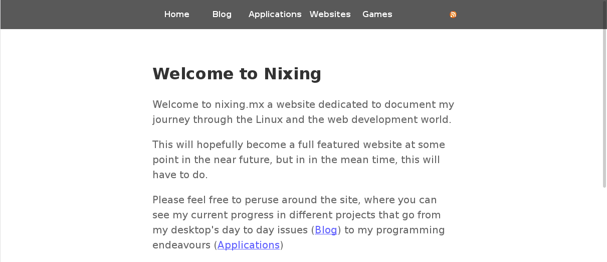
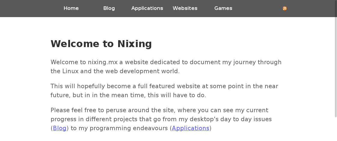

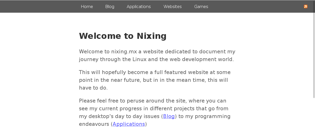
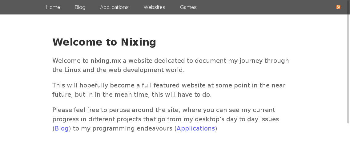
This is the how it used to look before our updates:

Conclusion
That’s it we finally made a native CSS Grid menu! The CSS is simpler and can be managed in a way that, to me, makes more sense and is easier to understand than having all sorts of 11% here and .7 there, I do a have a .8 but…well there’s only one.. :P.
Additionally I’ll be shipping this as a CSS boiler plate for Bourne to Blog so that others can make a very simple and clean menu for their blog if they so choose, Enjoy!